TypeScript
Breaking Down Libraries in Nx Monorepos with TypeScript Project References
Discover how to modularize libraries in Nx monorepos using TypeScript project references and custom plugins for cleaner, scalable architecture.
April 7, 2025
TypeScript
Discover how to modularize libraries in Nx monorepos using TypeScript project references and custom plugins for cleaner, scalable architecture.
April 7, 2025
This is the second article in a series on TypeScript project references in Nx monorepos and PNPM workspaces. You can read the previous article here.
In the previous part of the series we covered:
ts presetIn this article we’ll explore how to create and consume packages in an Nx monorepo using TypeScript Project References.
We’ll also set up a custom workspace plugin to automate package creation, enforce best practices, and enhance developer experience.
shadcn/uiTo keep things practical, we’ll use shadcn/ui as a familiar codebase to demonstrate how we can organize and manage workspaces. Instead of using the CLI or copy-pasting components, we’ll break the library into modular packages using React, Tailwind css, and Radix UI.
cn UtilityBefore diving into individual components, it’s worth identifying shared logic we’ll reuse across packages. The cn function from shadcn/ui it's widely used to merge class names using clsx and tailwind-merge, which makes it a strong candidate for the @nx-prefs/utils package.
Installingpnpm add -D clsx tailwind-merge -F @nx-prefs/utils
clsx and tailwind-merge.
utils.tsx:import { type ClassValue, clsx } from 'clsx' import { twMerge } from 'tailwind-merge' export function cn(...inputs: ClassValue[]) { return twMerge(clsx(inputs)) }
packages/utils/src/lib/utils.tsx.
utils.spec.tsx:import { cn } from './utils' describe('Utils', () => { it('should handle conditional class names', () => { const ifTrue = false const result = cn('class1', ifTrue && 'class2', 'class3') expect(result).toBe('class1 class3') }) it('should merge tailwind classes correctly', () => { const result = cn('bg-red-500', 'bg-blue-500') expect(result).toBe('bg-blue-500') }) })
packages/utils/src/lib/utils.spec.tsx.
We can leverage nx run-many to run all relevant checks and make sure everything works as expected:
Lint, test and buildnx run-many -t lint,test,build -p utils
utils.
In an Nx workspace, "project" and "package" are related but distinct concepts. Projects are the highest-level entities within the workspace, (e.g. apps, libs or plugins), while packages are the units of code that can be shared and reused across projects.
By now, you probably noticed the distinction between Nx project names (utils) and package names (@nx-prefs/utils). Depending on your preferences, using the same name for both can be a safe default.
Let’s configure our Next.js app to use TailwindCSS. First, install the required dependencies:
pnpm add -D tailwindcss @tailwindcss/postcss -F sandbox
Next, add a postcss.config.mjs file at the root of the sandbox app:
/* eslint-disable import/no-anonymous-default-export */
/** @type {import('postcss-load-config').Config} */
export default {
  plugins: {
    '@tailwindcss/postcss': {},
  },
}
apps/sandbox/postcss.config.mjs.
Lastly, remove the content of global.css and import tailwindcss:
@import 'tailwindcss';
apps/sandbox/src/app/global.css.
cnLet’s see if we can use the cn function. We’ll render two headings with the same classes—one using raw class names, and the other using cn. The cn function should correctly merge the styles so that the colors match the text content.
import { cn } from '@nx-prefs/utils'

export default function Home() {
  return (
    <section className="w-full h-screen flex items-center justify-center">
      <h1 className="text-red-500 text-blue-500">Red</h1>
      <h1 className={cn('text-red-500 text-blue-500')}>Blue</h1>
    </section>
  )
}
apps/sandbox/src/app/page.tsx.
Now, let’s make sure everything is wired up correctly. You should be able to lint, test, and build both the utils and sandbox projects by running:
nx run-many -t lint,test,build
Run the sandbox app:
nx dev sandbox
The application should look like this:
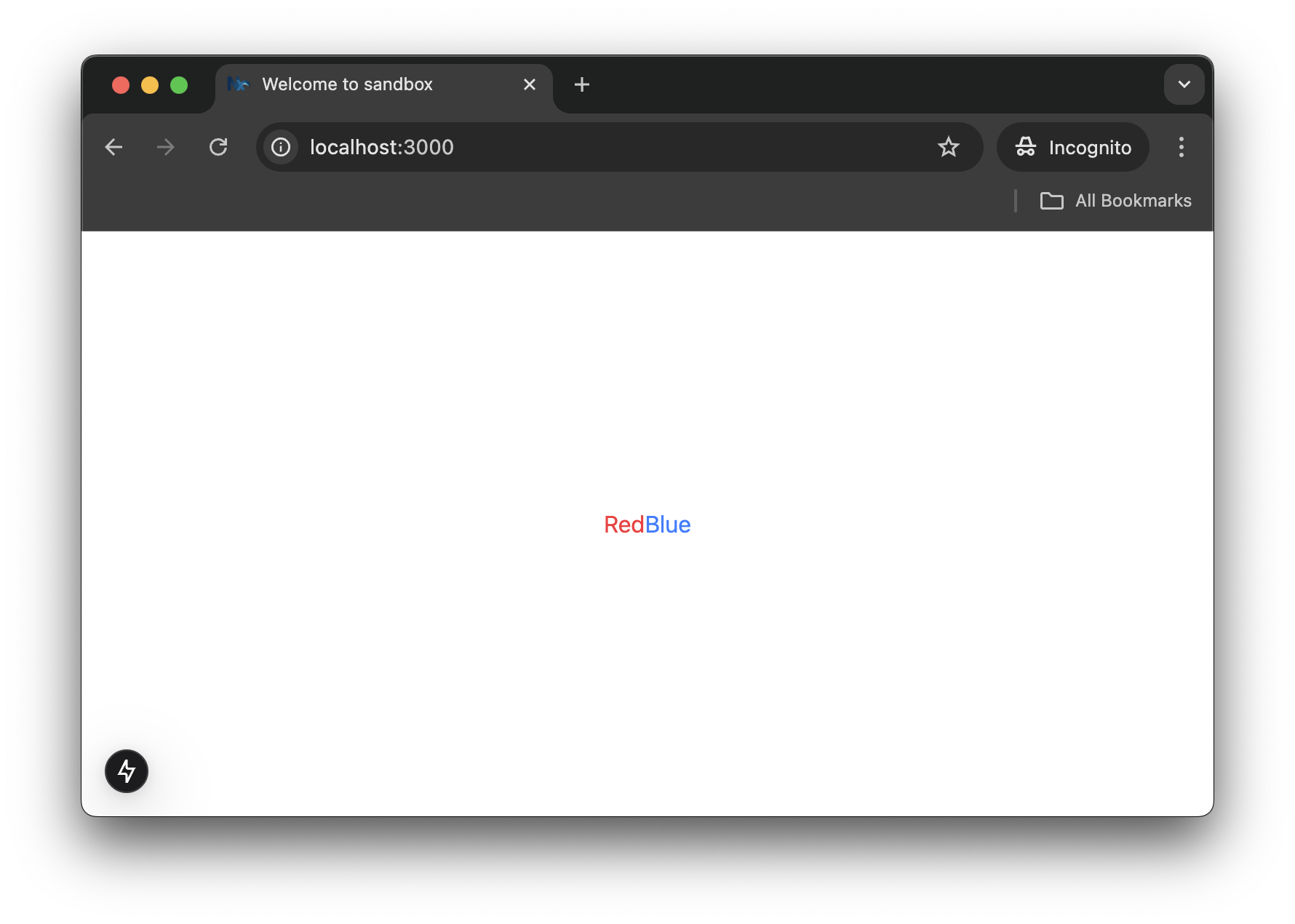
sandbox app preview.
Now let’s walk through creating another package—@nx-prefs/button. At this point, the steps should feel familiar to you.
@nx/react plugin:Generatingnx g @nx/react:library --directory=packages/button \ --name=button \ --bundler=vite \ --linter=eslint \ --unitTestRunner=vitest \ --importPath=@nx-prefs/button \ --useProjectJson=true \ --no-interactive
button project.
Installingpnpm add @radix-ui/react-slot class-variance-authority -F button
button dependencies.
@nx-prefs/utils:Intallingpnpm add @nx-prefs/utils --filter button --workspace
@nx-prefs/utils.
button.tsx with shadcn/ui's button component:import * as React from 'react' import { Slot } from '@radix-ui/react-slot' import { cva, type VariantProps } from 'class-variance-authority' import { cn } from '@/lib/utils' // change to `@nx-prefs/utils` const buttonVariants = cva(...) // redacted for brevity function Button({ className, variant, size, asChild = false, ...props }: React.ComponentProps<'button'> & VariantProps<typeof buttonVariants> & { asChild?: boolean }) { const Comp = asChild ? Slot : 'button' return ( <Comp data-slot="button" className={cn(buttonVariants({ variant, size, className }))} {...props} /> ) } export { Button, buttonVariants }
packages/button/src/lib/button.tsx.
button.module.css, and update the test suite on button.spec.tsx:import { render } from '@testing-library/react' import { Button } from './button' describe('Button', () => { it('should render successfully', () => { const { getByRole } = render(<Button>Click me</Button>) expect(getByRole('button')).toBeTruthy() }) it('should render with the correct text', () => { const { getByText } = render(<Button>Click me</Button>) expect(getByText('Click me')).toBeTruthy() }) })
packages/button/src/lib/button.spec.tsx.
button project:Running checks onnx run-many -t lint,test,build -p button
button.
If you followed the previous article, Nx has automatically synced your workspace. If not, when prompted, hit Enter.
To manually sync your workspace, run nx sync from the root of your workspace.
shadcn/ui StylesTo see our <Button /> variants in action, we need to update global.css to include the shadcn/ui’s theme variables and default styles.
We’ll also need to configure Tailwind v4.x to recognize and load styles from our package, which can be done using the @source directive:
Updated@import 'tailwindcss'; @source "../../node_modules/@nx-prefs/button"; @custom-variant dark (&:is(.dark *)); @theme inline { --radius-sm: calc(var(--radius) - 4px); --radius-md: calc(var(--radius) - 2px); --radius-lg: var(--radius); --radius-xl: calc(var(--radius) + 4px); --color-background: var(--background); --color-foreground: var(--foreground); --color-card: var(--card); --color-card-foreground: var(--card-foreground); --color-popover: var(--popover); --color-popover-foreground: var(--popover-foreground); --color-primary: var(--primary); --color-primary-foreground: var(--primary-foreground); --color-secondary: var(--secondary); --color-secondary-foreground: var(--secondary-foreground); --color-muted: var(--muted); --color-muted-foreground: var(--muted-foreground); --color-accent: var(--accent); --color-accent-foreground: var(--accent-foreground); --color-destructive: var(--destructive); --color-border: var(--border); --color-input: var(--input); --color-ring: var(--ring); } :root { --radius: 0.625rem; --background: oklch(1 0 0); --foreground: oklch(0.145 0 0); --card: oklch(1 0 0); --card-foreground: oklch(0.145 0 0); --popover: oklch(1 0 0); --popover-foreground: oklch(0.145 0 0); --primary: oklch(0.205 0 0); --primary-foreground: oklch(0.985 0 0); --secondary: oklch(0.97 0 0); --secondary-foreground: oklch(0.205 0 0); --muted: oklch(0.97 0 0); --muted-foreground: oklch(0.556 0 0); --accent: oklch(0.97 0 0); --accent-foreground: oklch(0.205 0 0); --destructive: oklch(0.577 0.245 27.325); --border: oklch(0.922 0 0); --input: oklch(0.922 0 0); --ring: oklch(0.708 0 0); } .dark { --background: oklch(0.145 0 0); --foreground: oklch(0.985 0 0); --card: oklch(0.205 0 0); --card-foreground: oklch(0.985 0 0); --popover: oklch(0.269 0 0); --popover-foreground: oklch(0.985 0 0); --primary: oklch(0.922 0 0); --primary-foreground: oklch(0.205 0 0); --secondary: oklch(0.269 0 0); --secondary-foreground: oklch(0.985 0 0); --muted: oklch(0.269 0 0); --muted-foreground: oklch(0.708 0 0); --accent: oklch(0.371 0 0); --accent-foreground: oklch(0.985 0 0); --destructive: oklch(0.704 0.191 22.216); --border: oklch(1 0 0 / 10%); --input: oklch(1 0 0 / 15%); --ring: oklch(0.556 0 0); } @layer base { * { @apply border-border outline-ring/50; } body { @apply bg-background text-foreground; } }
global.css.
The previous steps will be pretty much the same for all future component packages: generate the library, install the usual dependencies, clean up boilerplate, update imports, tweak tests, and so on.
This process—while straightforward—can be repetitive and prone to inconsistency over time, especially across large teams or growing codebases.
What if instead of memorizing multi-line nx generate commands, and rewriting boilerplate, we could define our own tailored setup once—and reuse it forever?
That’s where Nx workspace plugins come in. ✨
Custom plugins can enforce consistent naming and configuration, and generate README files or component templates. We can wrap all those repetitive steps and best practices into a single, streamlined generator.
Nx plugins can extend the capabilities of our workspace by providing built-in support for specific frameworks, tools, and workflows. A plugin typically includes:
From Nx's official documentation:
Nx plugins help developers use a tool or framework with Nx. They allow the plugin author who knows the best way to use a tool with Nx to codify their expertise and allow the whole community to reuse those solutions.
Plugins can be official (e.g. @nx/react, @nx/next, etc.), community-driven, or custom-built. They help enforce consistency, reduce setup time, and enhance developer productivity by encapsulating best practices into reusable pieces.
Executors are what actually perform tasks like building, testing, serving, or linting a project. They’re defined in each project's project.json or package.json files, and can also infer tasks automatically based on the configurations files of specific tools.
In this example, @nx/web:build is the executor that tells Nx how to build a web application:
Example executor configuration.{ "targets": { "build": { "executor": "@nx/web:build", "options": { "outputPath": "dist/apps/my-app", ... } } } }
We can also write our own custom executors to define how tasks should run for specific tooling or workflows.
Generators are automated code scaffolding tools. They can create files, configure dependencies, and update existing code to help us set up new projects, features, or libraries with ease.
Generators help us save time by enforcing consistent patterns and reducing manual setup and configuration. For example:
Example generator command.nx g @nx/react:component my-component -p my-lib-or-app
This would generate a new React component named MyComponent inside the my-lib-or-app project. Generators can be customized or created from scratch to fit your team's conventions.
Let’s walk through the process of building a custom Nx plugin to scaffold libraries. We'll use the @nx/plugin package to help us create and customize the plugin.
Start by installing the required package:
Installing plugin dependencies.pnpm add -D @nx/plugin -w
Then generate the plugin:
Creating workspace plugin.nx g @nx/plugin:plugin \ --name=plugin \ --linter=eslint \ --unitTestRunner=jest \ --useProjectJson=true \ --directory=packages/plugin \ --importPath=@nx-prefs/plugin \ --no-interactive
This will create a new package named plugin at packages/plugin, which can be imported as @nx-prefs/plugin.
If you run into a Project Graph Error, reset the Nx cache and stop the daemon by running:
Reloading Nx daemon.nx reset
Now, create a generator named library inside the plugin:
Creating a generator.nx g @nx/plugin:generator \ --path=packages/plugin/src/generators/library/generator \ --no-interactive
This creates the following file structure:
...
generators
└── library
    ├── files
    │   └── index.ts.template
    ├── generator.spec.ts
    ├── generator.ts
    ├── schema.d.ts
    └── schema.json
packages/plugin/src tree.
files/ - Contains EJS templates used to scaffold our package files dynamically.
generator.ts - Contains the generator’s logic: file generation, configuration, and automation.
schema.d.ts: Conventionally used to define the input option types for the generator.
schema.json: Specifies and validates input options, providing support for both CLI usage and Nx Console integration.
By default, the generator requires you to manually set options like name, directory, bundler, linter, test runner, and import path, which can be error-prone.
We can simplify the developer experience by:
directory optional with a sensible default.After improving our generator, we’ll be able to run:
nx g @nx-prefs/plugin:library alert
Instead of:
nx g @nx/react:library --directory=packages/alert \
  --name=alert \
  --bundler=vite \
  --linter=eslint \
  --unitTestRunner=vitest \
  --importPath=@nx-prefs/alert \
  --useProjectJson=true \
  --no-interactive
Start by defining our library generator's schema:
Updatedexport interface LibraryGeneratorSchema { name: string directory?: string }
schema.d.ts.
Then update schema.json to reflect the same structure:
Updated{ "$schema": "https://json-schema.org/schema", "$id": "nx-prefs-plugin-library-generator", "title": "Nx PRefs Library Generator", "type": "object", "properties": { "name": { ... }, "directory": { "type": "string", "description": "The directory of the new library." } }, "required": ["name"] }
schema.json.
Now that the schema is defined, let’s implement the generator logic. We’ll also define a normalizeOptions helper to centralize option handling and compute values for the templates.
Add a new type schema.d.ts to define the variables used by our templates:
Updatedexport interface LibraryGeneratorVariables { name: string importPath: string projectRoot: string offsetFromRoot: string }
schema.d.ts.
Then replace the contents of generator.ts:
Updatedimport { addProjectConfiguration, formatFiles, generateFiles, offsetFromRoot, Tree, } from '@nx/devkit' import * as path from 'path' import { LibraryGeneratorSchema, LibraryGeneratorVariables } from './schema' function normalizeOptions( options: LibraryGeneratorSchema ): LibraryGeneratorVariables { const name = String(options.name).toLowerCase() const importPath = `@nx-prefs/${name}` const projectRoot = options.directory ?? `packages/${name}` return { name, importPath, projectRoot, offsetFromRoot: offsetFromRoot(projectRoot), } } export async function libraryGenerator( tree: Tree, options: LibraryGeneratorSchema ) { const { projectRoot, ...variables } = normalizeOptions(options) addProjectConfiguration(tree, options.name, { root: projectRoot, projectType: 'library', sourceRoot: `${projectRoot}/src`, targets: {}, }) generateFiles(tree, path.join(__dirname, 'files'), projectRoot, { projectRoot, ...variables, }) await formatFiles(tree) } export default libraryGenerator
generator.ts.
We can now use variables like <%= name %>, <%= importPath %>, and <%= offsetFromRoot %> to dynamically inject values.
Our plugin's logic is complete, but we still have to update the template files. Files with one or more ellipses (...) have been redacted for brevity.
Copy the structure from an existing library like button into our generator’s files/ directory, excluding the project.json.
Add the .template suffix to each file:
files/
├── .babelrc.template
├── eslint.config.mjs.template
├── package.json.template
├── README.md.template
├── tsconfig.json.template
├── tsconfig.lib.json.template
├── tsconfig.spec.json.template
└── vite.config.ts.template
files directory tree.
files/src/index.ts.templateUpdate both variable's name and value, or copy and paste the following.
export const <%= name %> = "Hello from <%= name %>!";
files/eslint.config.mjs.templatebaseConfig import.
import nx from '@nx/eslint-plugin'
import baseConfig from '<%= offsetFromRoot + "eslint.config.mjs" %>'

export default [
  ...
]
files/package.json.templateUpdate the name property, remove dependencies, and optionally add
peerDependencies as shown.
{
  "name": "<%= importPath %>",
  "dependencies": {}, // remove any dependencies here
  "devDependencies": {},
  "peerDependencies": {
    "@types/react": "^18.3.1",
    "@types/react-dom": "^18.3.0",
    "react": "^18.3.1",
    "react-dom": "^18.3.1"
  },
  "peerDependenciesMeta": {
    "@types/react": {
      "optional": true
    },
    "@types/react-dom": {
      "optional": true
    }
  }
}
files/README.md.templateAdd name and importPath where needed, or simply copy and paste the
template below.
# <%= importPath %>

The `<%= name %>` package provides a customizable and reusable component for your application. It is designed to be lightweight and easy to integrate into any project.

## Installation

To install the package, use the following command:

```bash
npm install <%= importPath %>
```

## Usage

Import the component into your project and use it as follows:

```tsx
import { Component } from '<%= importPath %>'

function Example() {
  return <Component />
}
```

## Running unit tests

To execute the unit tests via [Vitest](https://vitest.dev/), run:

```sh
nx test <%= name %>
```
files/tsconfig.json.templateextends property as shown.
{
  "files": [],
  "include": [],
  "references": [
    ...
  ],
  "extends": "<%= offsetFromRoot + "tsconfig.base.json" %>"
}
files/tsconfig.lib.json.templateextends property as shown and remove any references.
{
  "extends": "<%= offsetFromRoot + "tsconfig.base.json" %>",
  "compilerOptions": { ... },
  "exclude": [ ... ],
  "include": [ ... ],
  "references": [] // remove any references here
}
files/tsconfig.spec.json.templateUpdate the extends property as shown and keep everything else as is.
{
  "extends": "<%= offsetFromRoot + "tsconfig.base.json" %>",
  "compilerOptions": { ... },
  "include": [ ... ],
  "references": [ ... ]
}
files/vite.config.ts.templateUpdate properties cacheDir and name (the latter under build.lib) inside
defineConfig.
/// <reference types='vitest' />
import { defineConfig } from 'vite'
import react from '@vitejs/plugin-react'
import dts from 'vite-plugin-dts'
import * as path from 'path'

export default defineConfig(() => ({
  root: __dirname,
  cacheDir: '<%= offsetFromRoot + "node_modules/.vite/packages/" + name %>',
  plugins: [ ... ],
  build: {
    ...
    lib: {
      entry: 'src/index.ts',
      name: '<%= name %>',
      fileName: 'index',
      formats: ['es' as const],
    },
    ...
  },
}))
Add to packages/plugins/src/index.ts:
Updatedimport { NxPlugin } from '@nx/devkit' const plugin: NxPlugin = { name: '@nx-prefs/plugin', } export = plugin
index.ts.
Note: There may be a regression in @nx/plugin:generator that incorrectly
sets the generator name in generators.json. This may already be fixed in
versions later than v20.7.0, but if not, update it manually.
Replace packages/plugins/generators.json with:
Fixed{ "generators": { "library": { "factory": "./dist/generators/library/generator", "schema": "./dist/generators/library/schema.json", "description": "NX PRefs Library Generator" } } }
generators.json.
Update generator.spec.ts to match our implementation:
Updatedimport { createTreeWithEmptyWorkspace } from '@nx/devkit/testing' import { Tree, readProjectConfiguration } from '@nx/devkit' import { libraryGenerator } from './generator' import { LibraryGeneratorSchema } from './schema' describe('library generator', () => { let tree: Tree const options: LibraryGeneratorSchema = { name: 'test' } beforeEach(() => { tree = createTreeWithEmptyWorkspace() }) it('should run successfully', async () => { await libraryGenerator(tree, options) const config = readProjectConfiguration(tree, 'test') expect(config).toBeDefined() }) })
generator.spec.ts.
Then verify that all targets run successfully:
Runningnx run-many -t lint,test,build -p plugin
plugin checks.
We are now ready to generate packages using our custom plugin! 🎉
To scaffold a new alert package:
nx g @nx-prefs/plugin:library alert
Add it to the sandbox app:
pnpm add @nx-prefs/alert --filter sandbox --workspace
Then import and use it inside page.tsx:
import { alert } from '@nx-prefs/alert'
import { Button } from '@nx-prefs/button'

export default function Home() {
  return (
    <section className="w-full h-screen flex flex-col items-center justify-center">
      <Button>{alert}</Button>
    </section>
  )
}
apps/sandbox/src/app/page.tsx
If everything is wired up correctly, you should see:
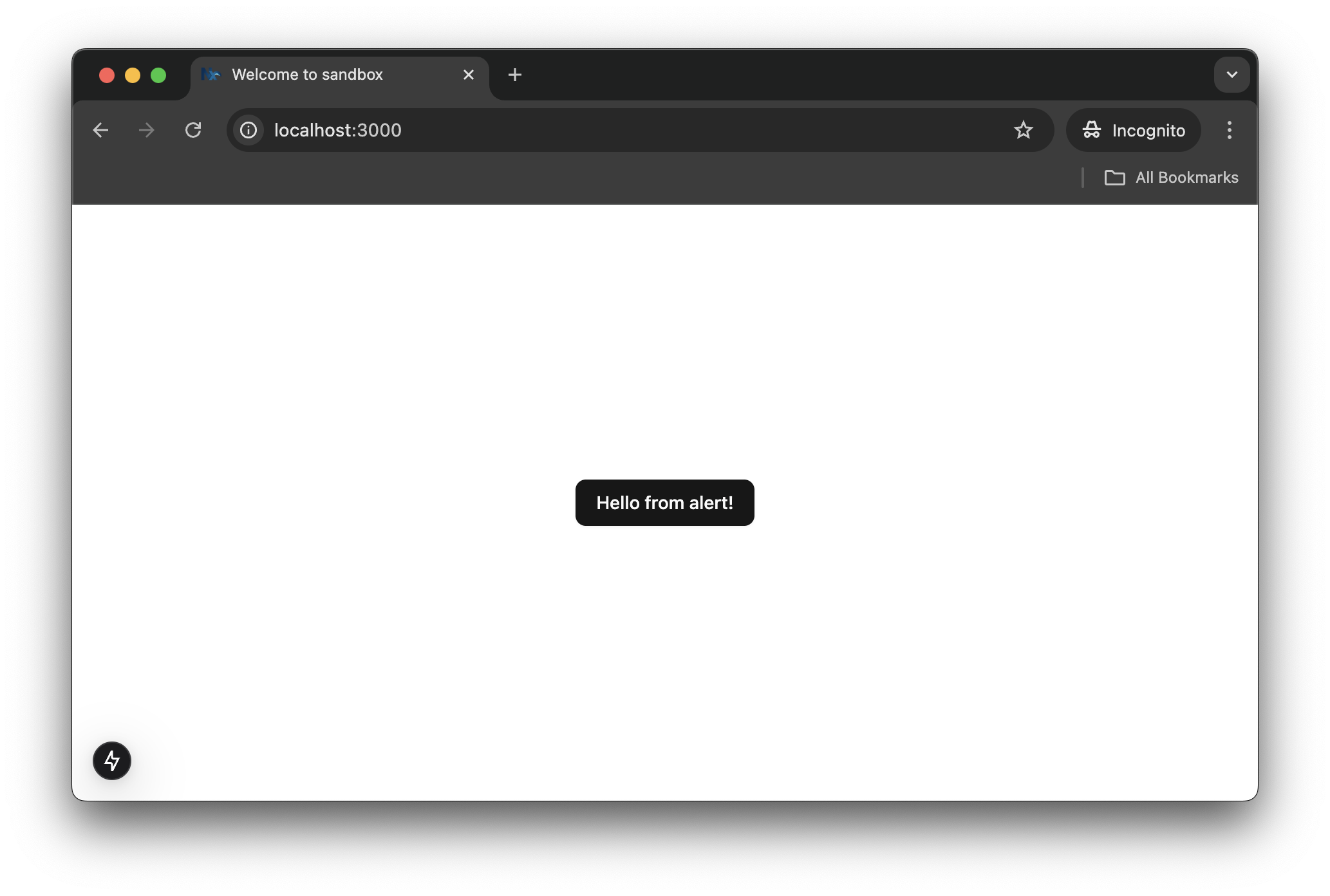
sandbox app preview.
🥳 Congratulations! You've just created your own Nx plugin and successfully used it to scaffold and integrate a new package into a monorepo app.
In the next article, we’ll level up our monorepo setup by exploring:
syncpack to manage dependencies across all packages.The author is not affiliated with the Nx team, and this article is not sponsored. The content presented is based on the author’s personal experience and should not be regarded as a definitive or authoritative source.